The Builder Market (TBM)
Blueprints for a Better Experience
UX/UI Design Internship • 5 min read
A B2C platform that connects homeowners, contractors, and designers through collaborative moodboard tools.
Overview
From Onboarding to Brand Presence
During this internship, I aimed to unify how users discover and navigate The Builder Market’s platform by designing clarity and cohesion across onboarding, tutorials, promotional assets, and web experiences.
This internship was about more than refining the existing UI; it was about creating a seamless narrative that guided users to confidence with the interface.
Problem Definition, Ideation, Prototyping + Interaction
Process
UX/ UI Designer
My Role
Figma, Photoshop
Tools
12 weeks
Duration
May-Aug 2025
Table of Contents
01
Onboarding + Moodboard Tutorial Design
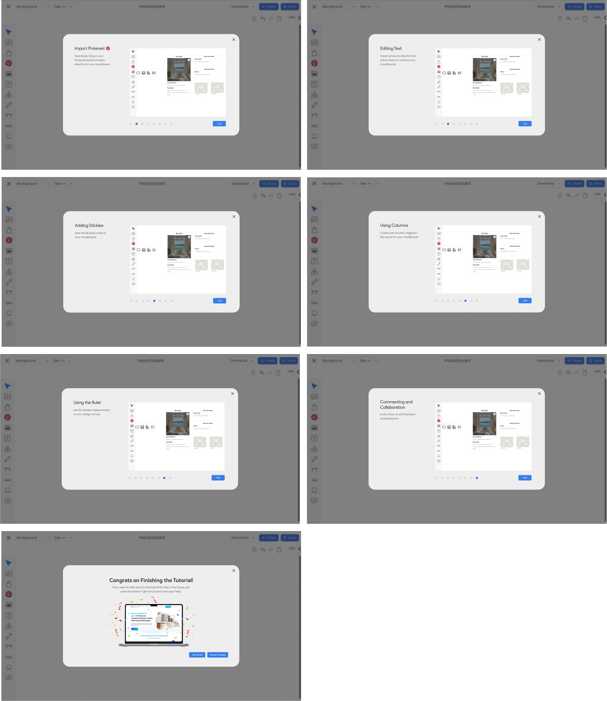
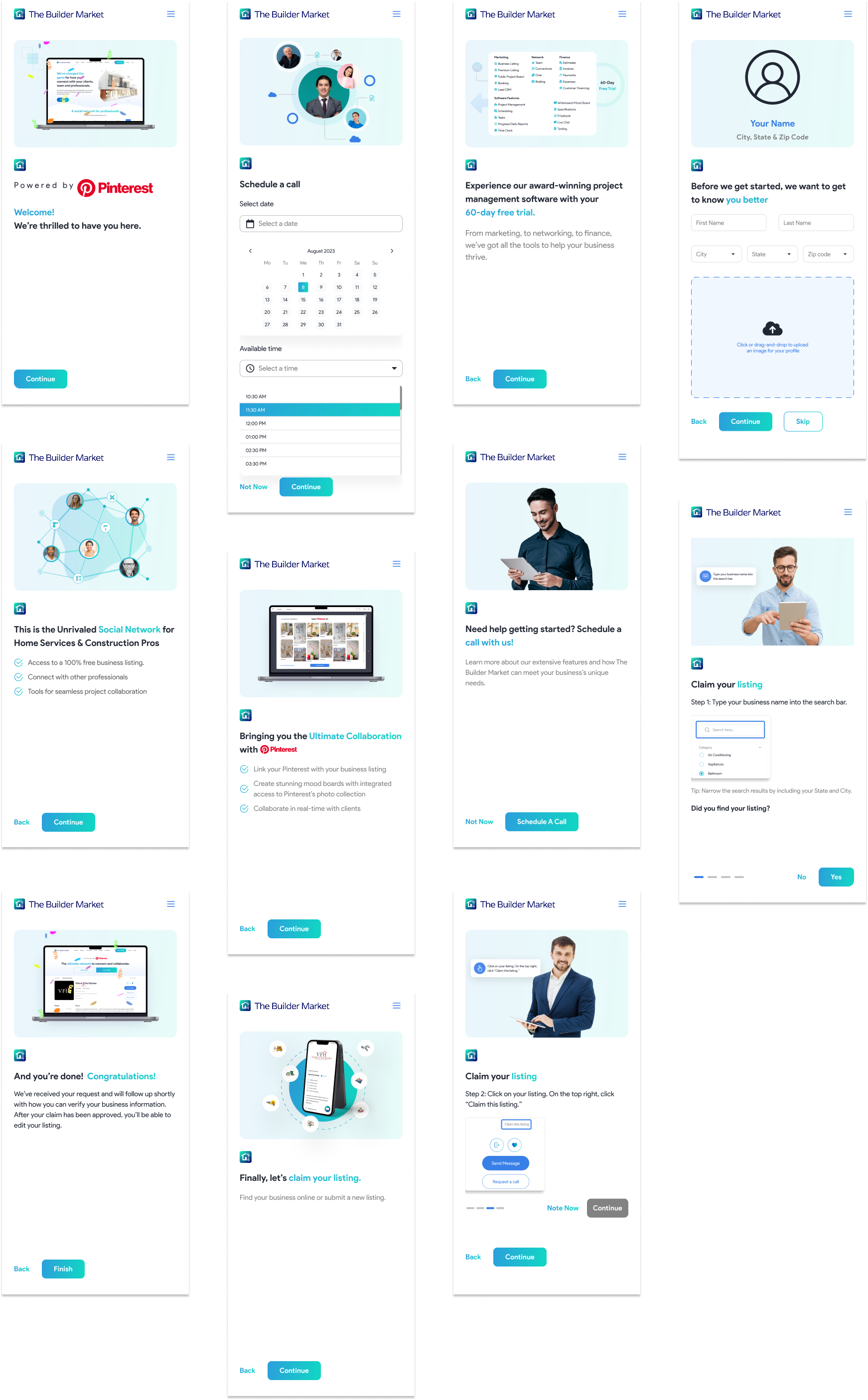
I led the re-design of the onboarding and tutorial flow for the Builder Market’s whiteboard feature (introduced new users to layout tools and collaboration features).
Moodboard Tutorial: The Before
After establishing a clear entry point through onboarding, I turned my focus to guiding users once they began exploring the platform’s tools (specifically the Moodboard feature). This next phase built on the same principles of clarity and accessibility as the onboarding process.
I was first presented with this design. Although it had good elements, there were some things that could be improved.
Minimal brand integration
No clear way to navigate backward,
To Fix
Exit "X” button
Progress Tracker
To Keep
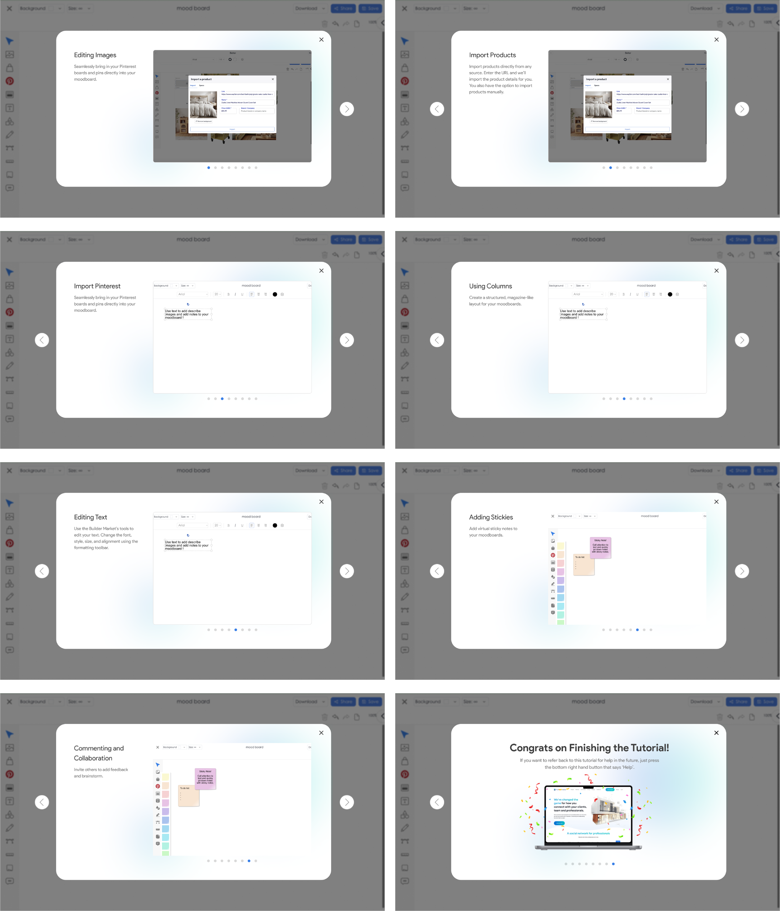
Moodboard Tutorial: The After
I implemented my changes to make the tutorial UI cleaner, more navigable, and visually aligned with the brand.
Added a progress tracker and bi-directional arrows for control
Integrated Builder Market’s gradient branding for cohesion
Kept a visible “X” exit button to reinforce user autonomy
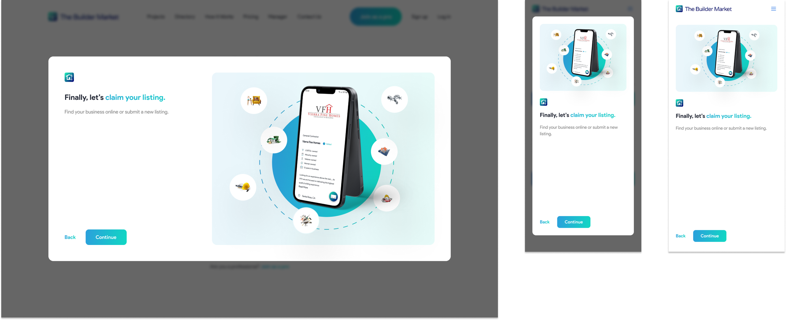
Key Implementations
The Before
The onboarding flow was designed to help new users understand The Builder Market’s purpose from the moment they arrived. I created responsive onboarding screens adaptable across desktop and mobile.
02
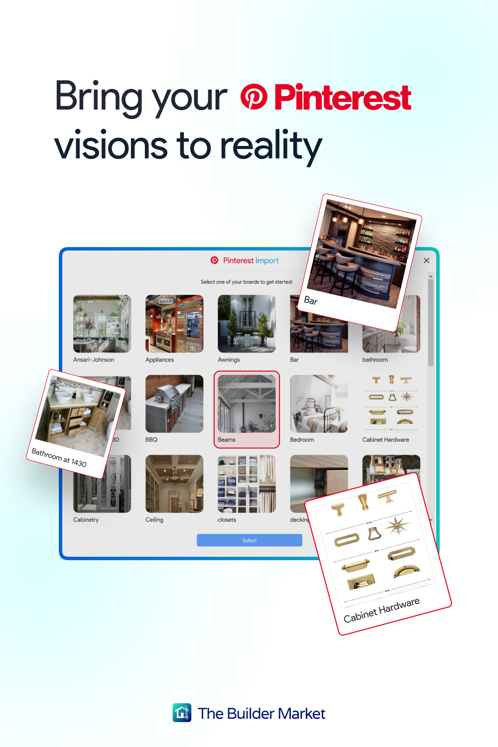
Promotional Carousel Design
I led the re-design of The Builder Market’s promotional slides for Pinterest-powered campaigns to make them more concise and engaging.
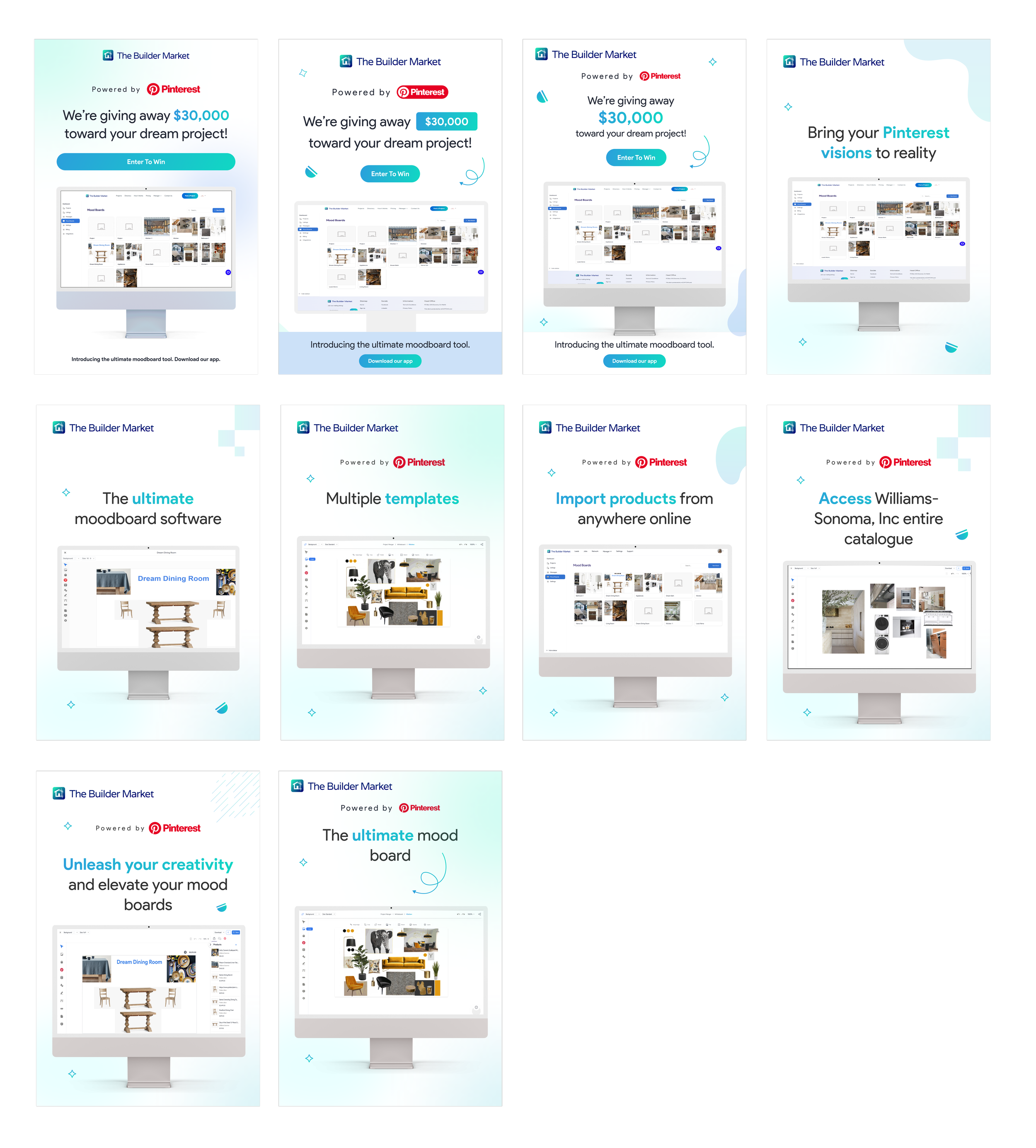
The Before
I was first presented with this design. Although it had good elements, there were some things that could be improved.
Repetitive slides with the same computer mockup.
Redundant copy and cluttered compositions.
Weak brand differentiation.
To Fix
The After
I implemented my changes to streamline the storytelling with stronger brand identity and faster comprehension.
Condensed the content into five clear, narrative-driven slides.
Introduced Pinterest red + Builder Market blue gradients for contrast and recognition.
Removed unnecessary mockups and used dynamic composition to fill space effectively.
Designed cross-platform assets for both carousel posts and physical posters.
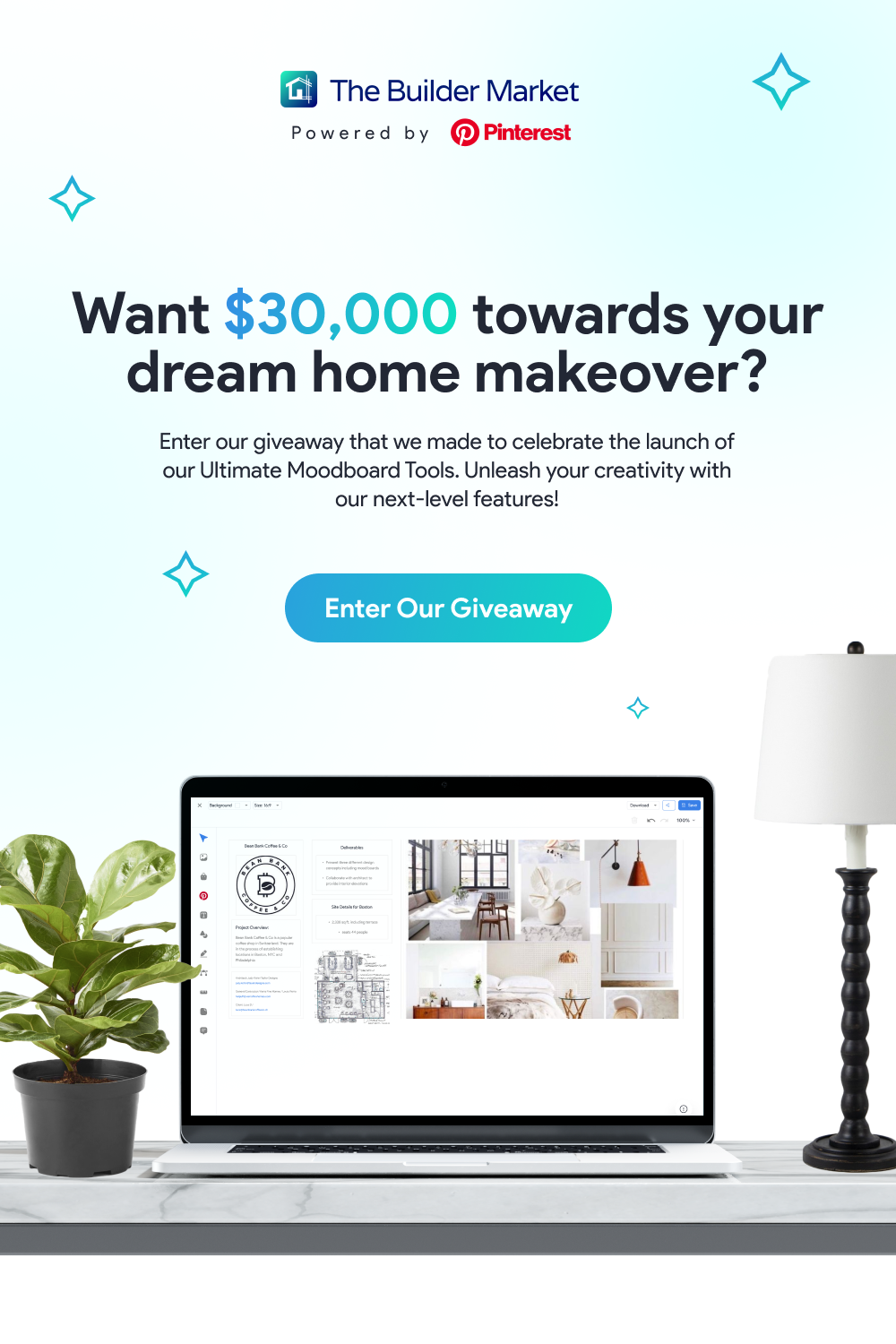
Key Implementations
03
Homepage
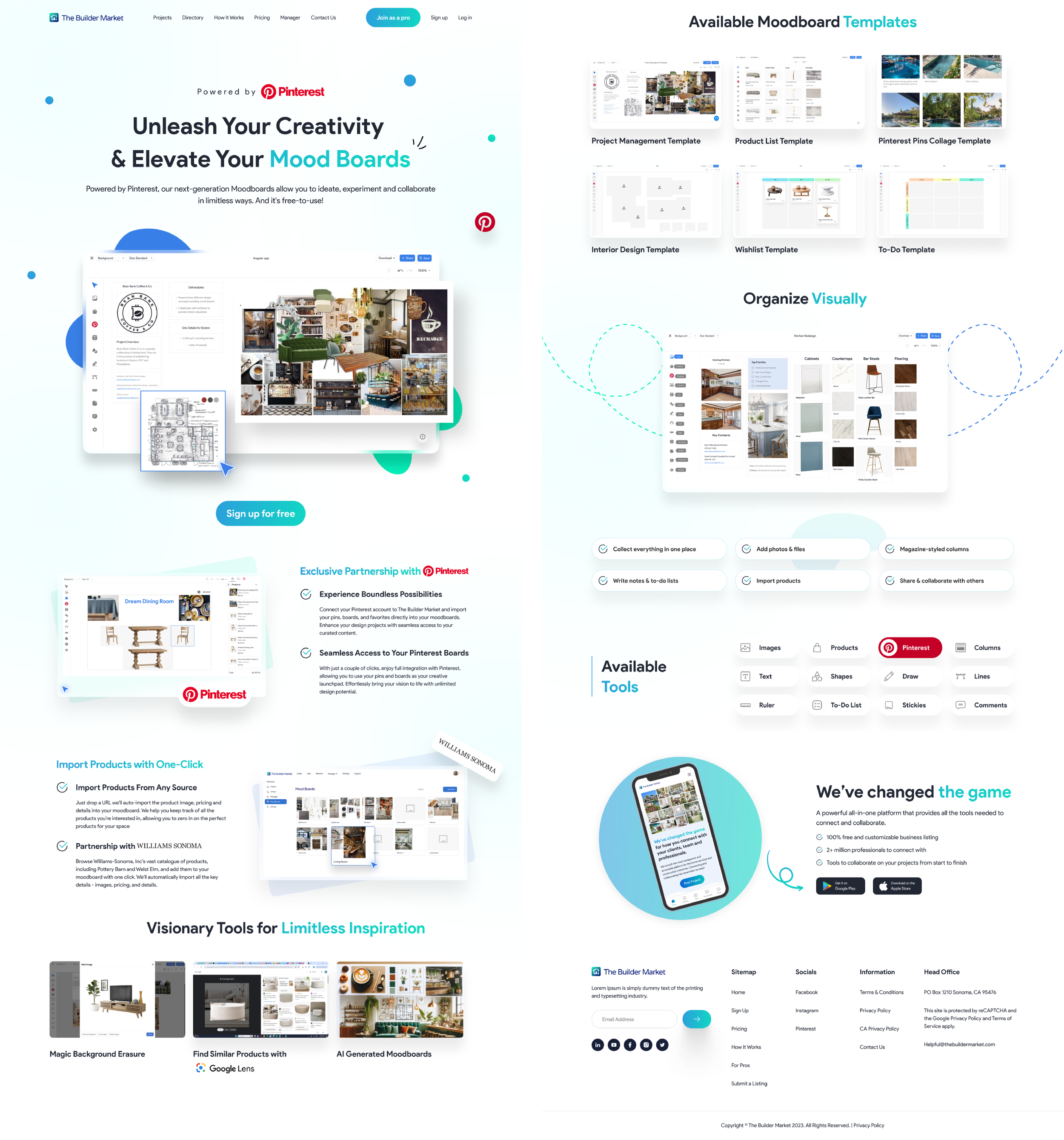
I collaborated with other interns to re-design the existing TBM homepage, with a focus on clarity and brand storytelling.
Decisions Made
My team and I created a cohesive + visually layered homepage that communicates purpose within a few seconds.
We designed a scroll-based narrative that introduced the moodboard feature and highlighted brand partnerships.
Used visual modules to highlight integrations (Pinterest, Williams-Sonoma).
Strengthened CTA hierarchy and unified typography + color systems.
04
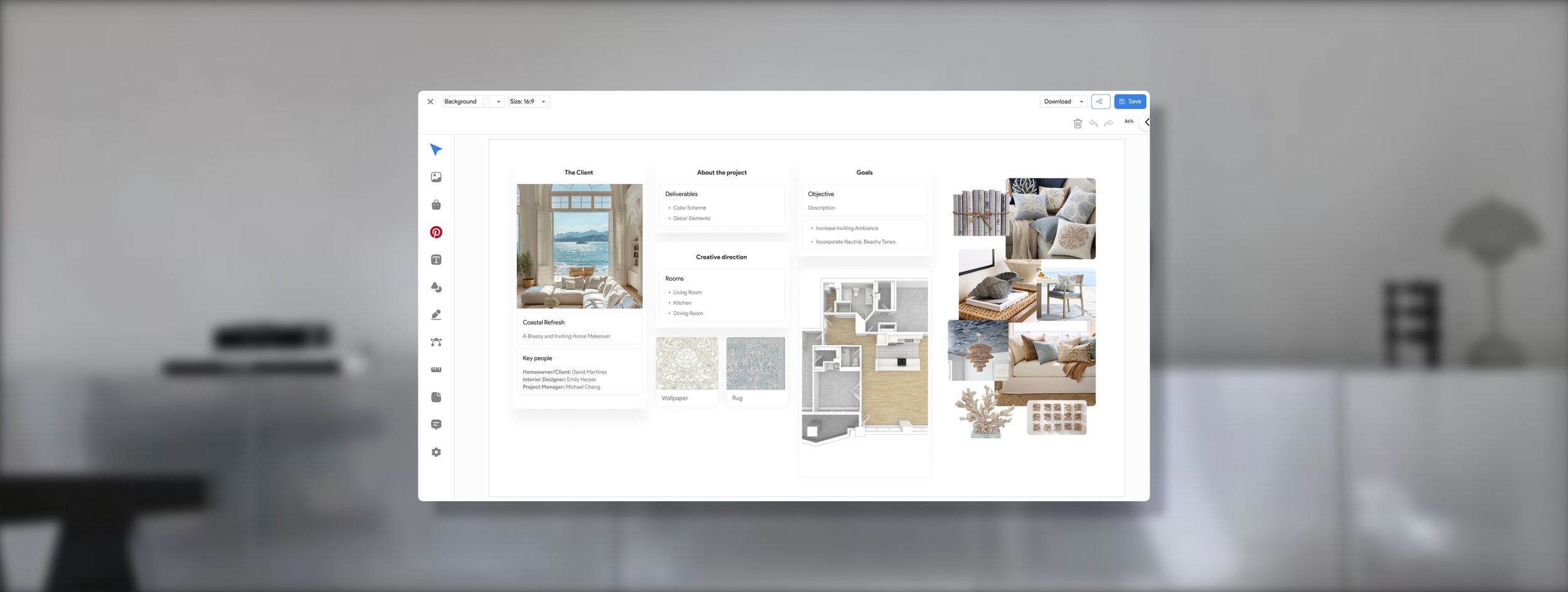
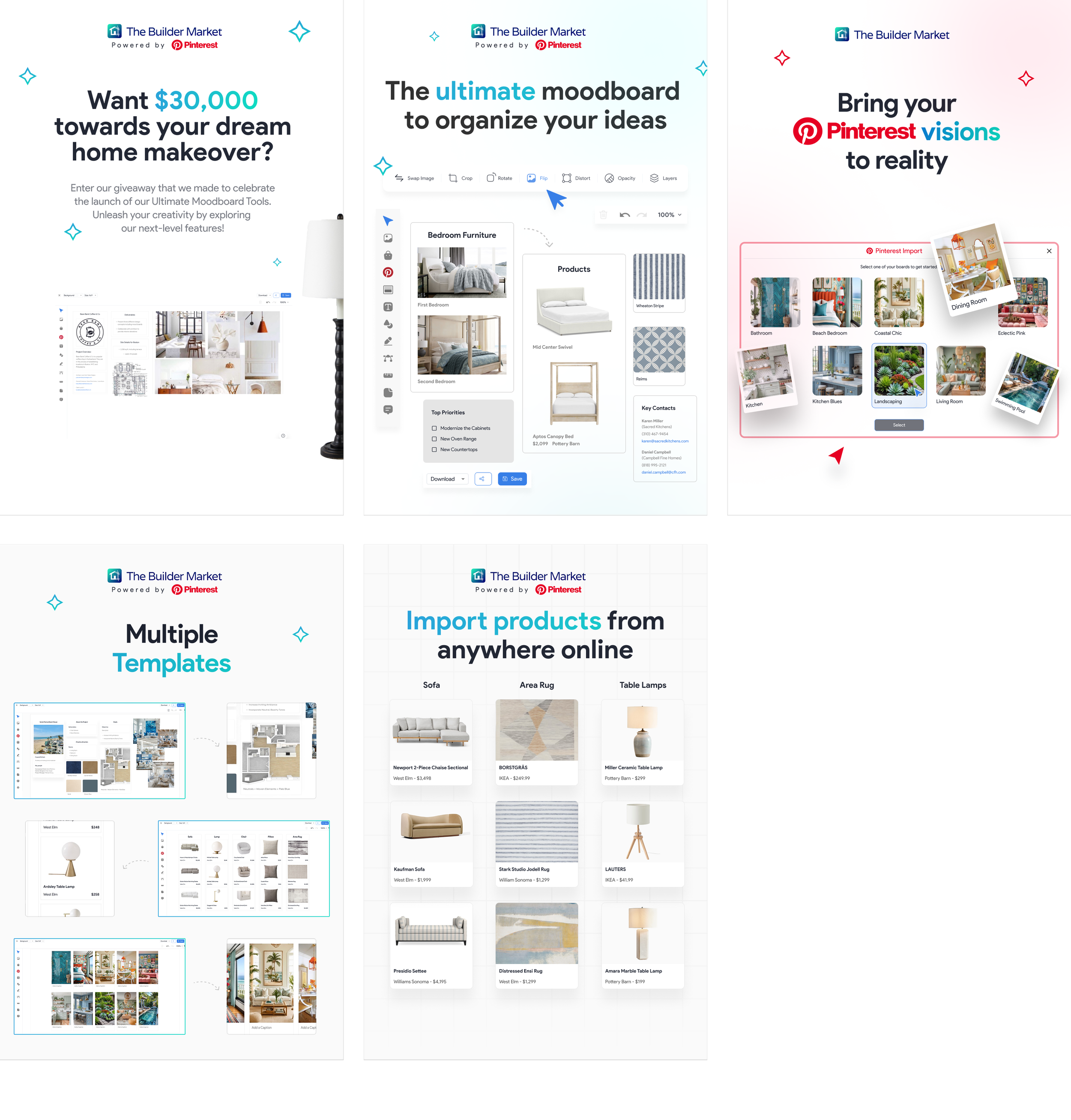
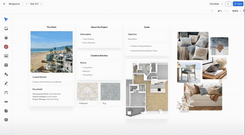
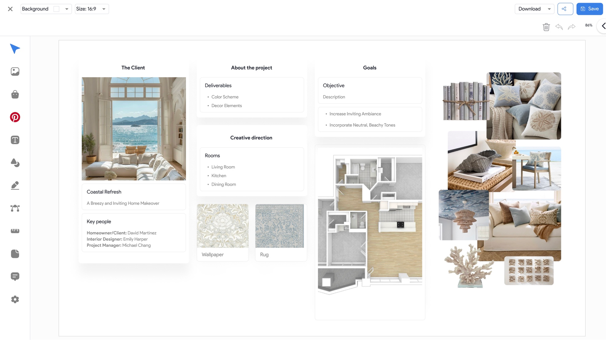
Moodboard
I collaborated with other interns and designed mockups to show real-world use of the new moodboard feature.
Decisions Made
My team and I wanted to show how creative professionals could use the TBM’s tools to plan and present within a single workspace.
Demonstrated Pinterest and Williams-Sonoma imports in action.
Built layouts showing shared collaboration between clients and contractors.
Applied the column-based layout system for structure and visual appeal.
05
Reflection


As a design intern, I learned that clarity is a form of empathy and not just a visual principle. Small decisions, (like consistent spacing or a clearer hierarchy) can transform how users feel when they first interact with a product.
I also learned that cohesion builds trust when working across onboarding, tutorials, and marketing assets. Users navigate with confidence when every touchpoint speaks the same design language.
And a Big Thank You to my team and the Founder + CEO of TBM, Brett Taylor!
