Starbucks Smart Re-Order AUI
Skip the Steps, Savor the Sips
case study • 5 min read

An Adaptive User Interface (AUI) that learns from customer routines to streamline the Starbucks mobile ordering flow.
With one tap, frequent users can instantly reorder their favorites to save time and reduce friction during busy routines.
The Problem
Re-Ordering is Too Rigid
The Starbucks app requires 16+ taps to reorder a regular drink. This repetitive, one-size-fits-all flow creates unnecessary friction, especially for customers with consistent daily habits.
The app doesn’t adapt to time, location, or context, and fails to anticipate user needs
I wondered: How might we reduce interaction cost for frequent users without disrupting occasional ones?
Research + Opportunity, Problem Definition,
Process
Ideation, Prototyping + Interaction, Usability Testing
Lead UX/ UI Designer
My Role
Figma
Tools
3 weeks
Duration
Jan-Feb 2025
The Solution
Smart Predictive Re-Order
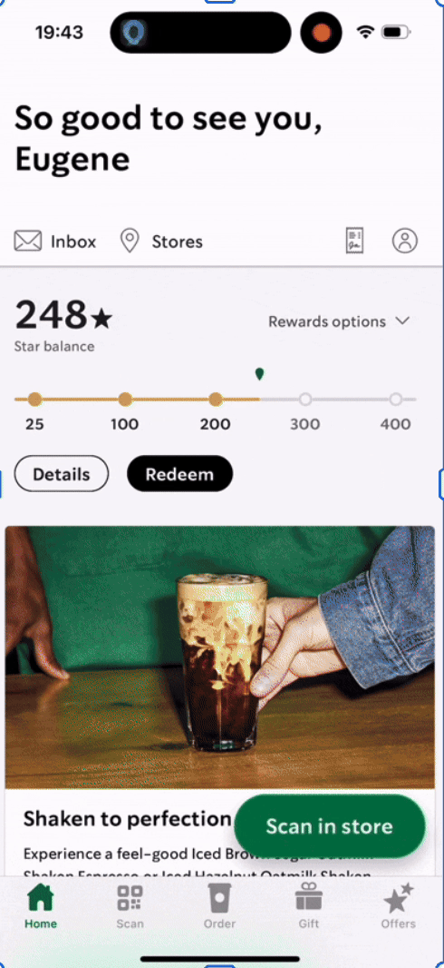
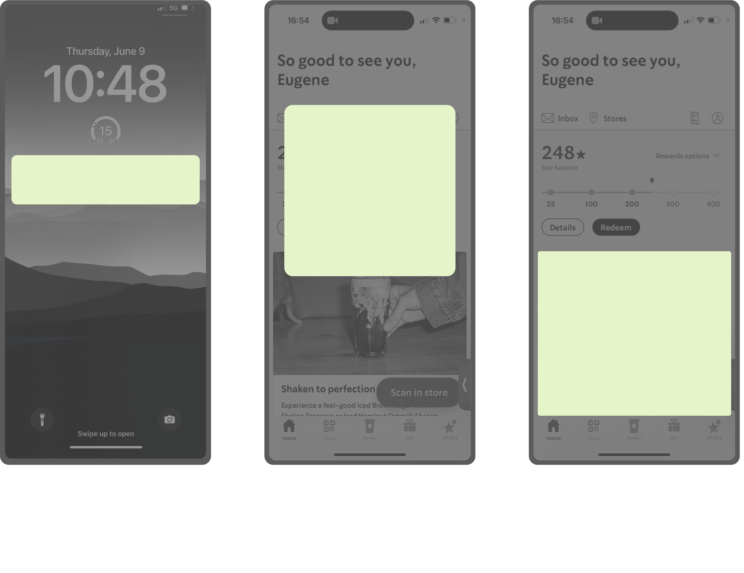
Starbucks UI
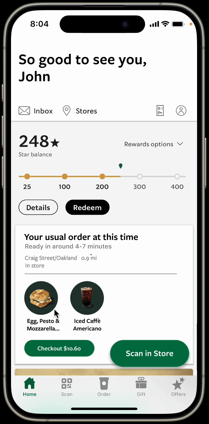
Our UI
Detects patterns in order frequency (ex: “Grande Iced Americano, 8 AM, Main Street Starbucks”)
Surfaces a Re-Order button at the right time and place.
With one tap, users skip redundant steps and head straight to checkout.
Anticipate intent, but never override choice.
Table of Contents

01 Research
Every Minute Counts: 16 Taps for Daily Coffee
Narrowing Down: Why Starbucks?
While many ideas showed promise, we prioritized solutions that could demonstrate clear and immediate value to users.
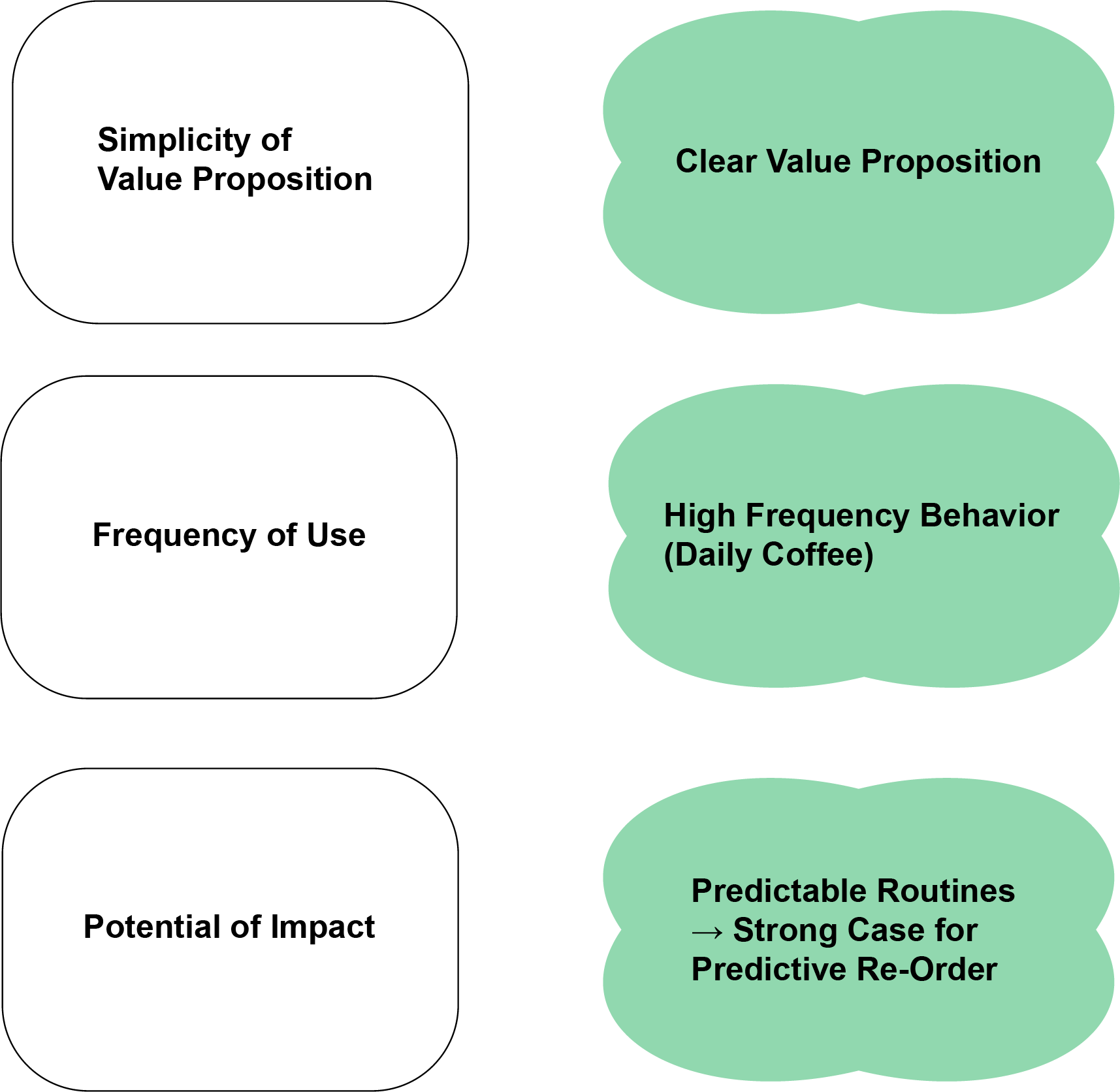
Starbucks emerged as the strongest candidate: a high-frequency use case, a simple and relatable flow, and clear room for impact.

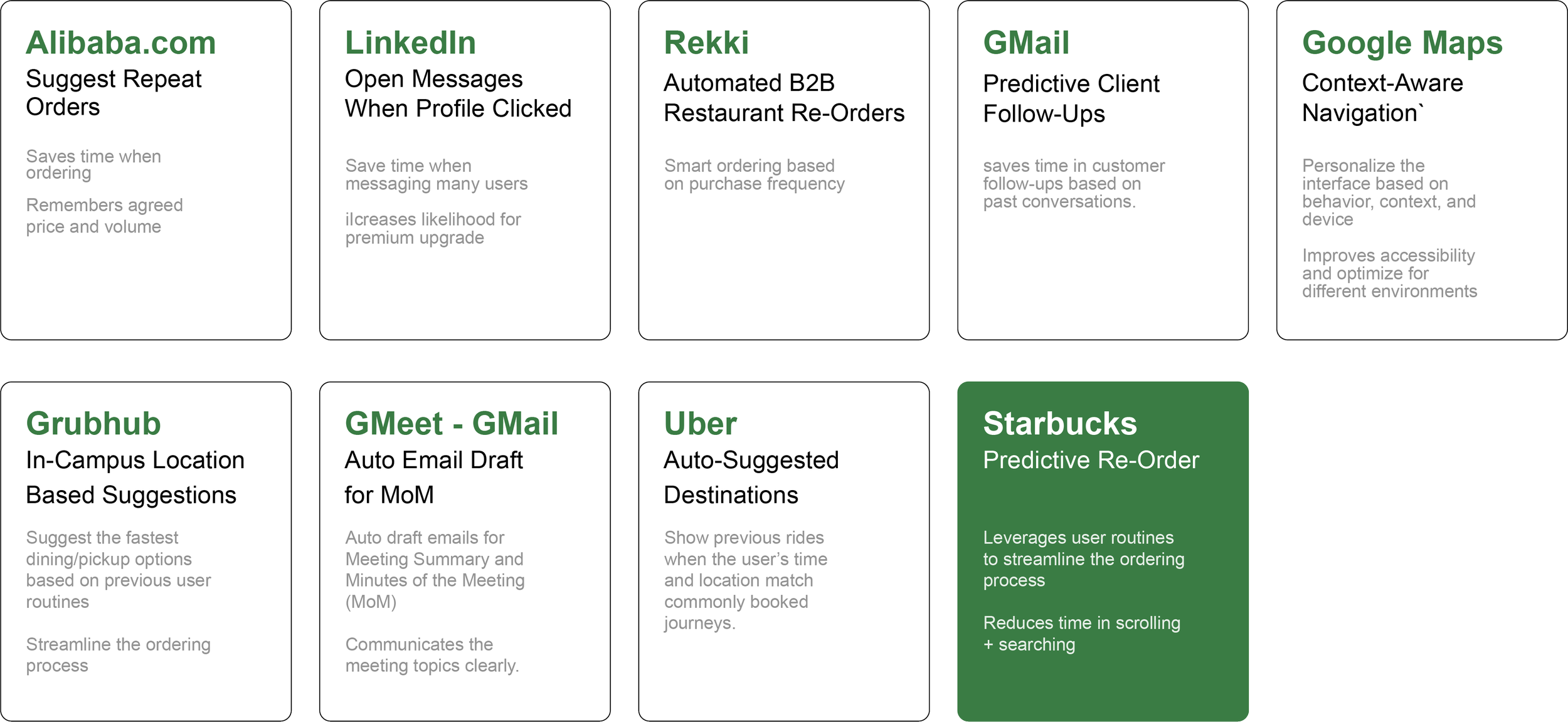
Scan and Evaluation
We conducted AUI opportunity scans across apps like LinkedIn, Grubhub, Uber, and Gmail.
We then evaluated each concept against criteria: simplicity of value proposition, frequency of use, and potential for impact.
Literature Review
After selecting Starbucks as our focus, we grounded this decision with a literature review.
We found insights on mobile app loyalty and routine usage, strong pattern consistency in user orders, and surges in mobile ordering during commute and peak hours.
Yet, despite these routines, the Starbucks app requires 16+ taps to reorder a favorite drink.
For time-pressed commuters, this repetitive friction adds unnecessary effort to an otherwise habitual act.
02 Synthesis
Humanizing the Data:
Designing for the Everyday Commuter
Defining the Problem
To humanize our research data, we developed a persona.
We primarily focused on the issue of cognitive fatigue in what should be a habitual + effortless action.

Synthesis Insight
Sara’s biggest frustration is time lost navigating the same digital path each day.

Problem Statement
Sara, a working parent who commutes daily between school drop-offs, the office, and errands.
Balancing User Needs + Business Value
By reframing this insight through both user and business lenses, we identified mutual goals.
How might we help consistent Starbucks customers quickly reorder their favorites without forcing them through redundant flows?
we identified that Starbucks plays a ritualistic role in her morning routine: a brief + dependable moment of consistency before the day begins.
Despite her loyalty to the brand and the app, Sara often experiences unnecessary friction in the mobile ordering process. Each morning, she repeats the same series of steps: reopening the app, locating her favorite order, confirming details, and waiting for confirmation.
03 Ideation
One Tap, Big Impact
Design Directions
With the problem defined, we explored multiple design directions for the how and where to introduce a predictive reorder feature within Starbucks’ existing interface.
We evaluated each concept across three variables: intrusiveness, speed, and clarity.

Narrowing Down:
Why the Predictive Home-Screen Cards?
The home-screen predictive reorder card emerged as the best balance. It is intuitive but not intrusive.
It adapts based on time, day, and location and surfaces a “reorder” card when the system detects consistent behavior. Users will be able to remain in control by being able to scroll away to reinforce trust while reducing friction.
04 Design: Lo-Fi - Hi-Fi
From Sketches to Seamless Flow

Lo-Fi Prototype
I hand-drew wireframes to both analyze Starbucks’ existing reorder flow and identify redundant interactions (top) and explore how to add our predictive reorder card (bottom).
The goal for the current app analysis was to visualize how many steps a user currently takes to complete a routine reorder and identify specific pain points. For our redesign, we focused on reducing scroll depth, maintaining layout familiarity, and ensuring the new element felt native to the existing Starbucks UI.
The lo-fi sketches established a clear structure for a predictive reorder card that merges with the existing Starbucks UI.
This allowed for faster reordering without breaking visual or behavioral expectations.
Mid-Fi Prototype
Using the established layout, we created digital wireframes to refine interactions, hierarchy, and navigation flow.
This stage focused on clarity and usability, and ultimately tested the transition from “Your Usual Order” to checkout.
What Changed:
Introduced a predictive reorder card with one-tap “Quick Order.”
Linked the card directly to the Review Order screen to minimize steps.
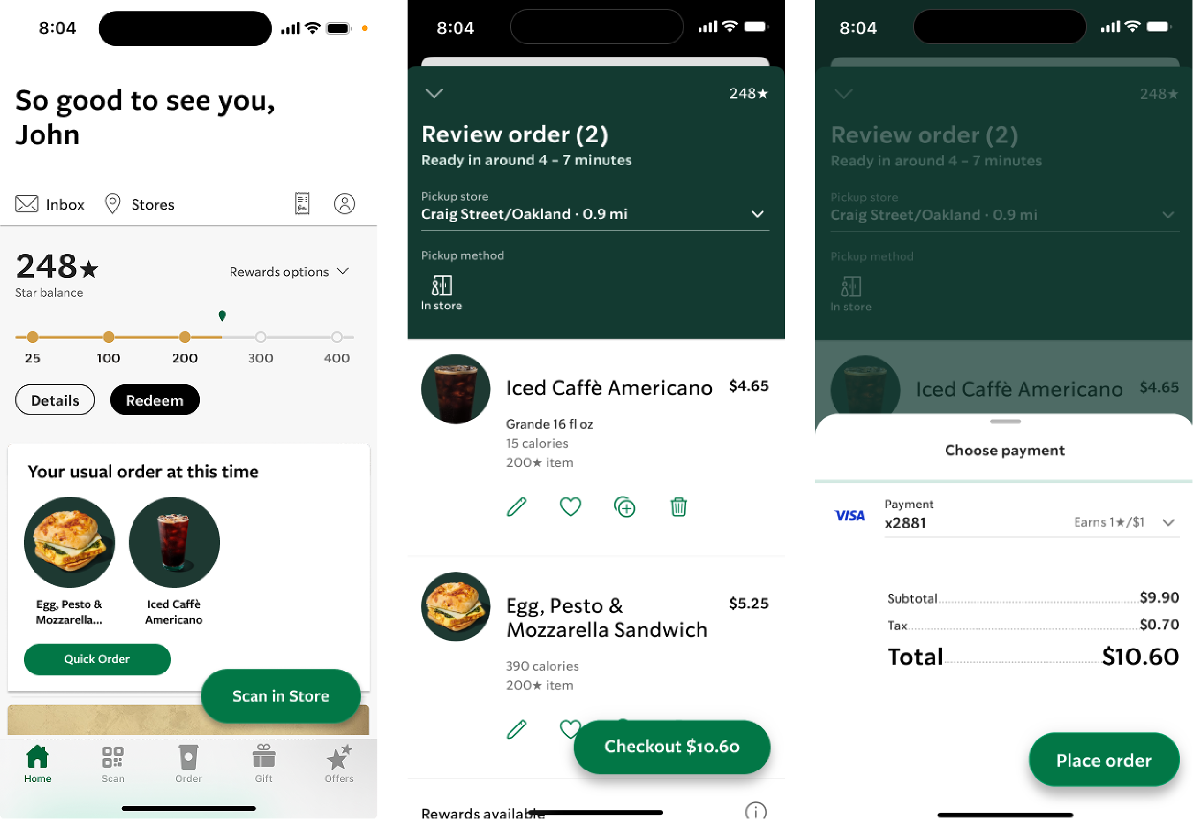
Users could now reorder their usual items with three screens instead of seven. They could maintain a sense of control with reduced decision fatigue.
This feedback pushed us to narrow our scope and return to our original target: consistent Starbucks commuters who value convenience above customization.
Hi-Fi Prototype
In response, we refined the design to focus on this high-frequency user segment, and prioritized speed, trust, and minimal friction over broad generalization.
The result was an immediate checkout experience that reduced unnecessary steps while preserving transparency.

Key Considerations
Maintain visual consistency with Starbucks’ established hierarchy (typography, spacing, button shapes)
Keep content concise but informative (item names, pickup store, “Quick Order” button)
Ensure the predictive element remains visible but optional, (let users scroll past as easily as other banner cards)
Balance text visibility and image size for quick scannability
Mid-Fi Testing
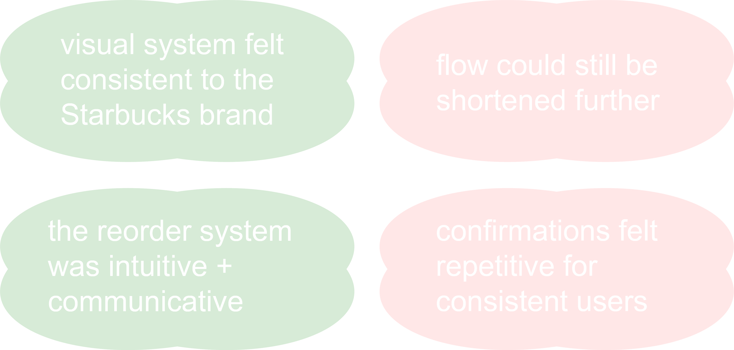
We conducted think-aloud usability testing with five peer participants to evaluate clarity, perceived speed, and overall usability.
Overall, the feedback was positive and validating, but users emphasized that 3 screens still felt too long.


For these users, efficiency + confidence outweigh the need for repeated checks.

The final prototype transformed reordering from a multi-step process into a single, confident action.
By designing specifically for consistent commuters, we aligned the interface with real behaviors to make the experience faster, smarter and more personal.
What Changed:
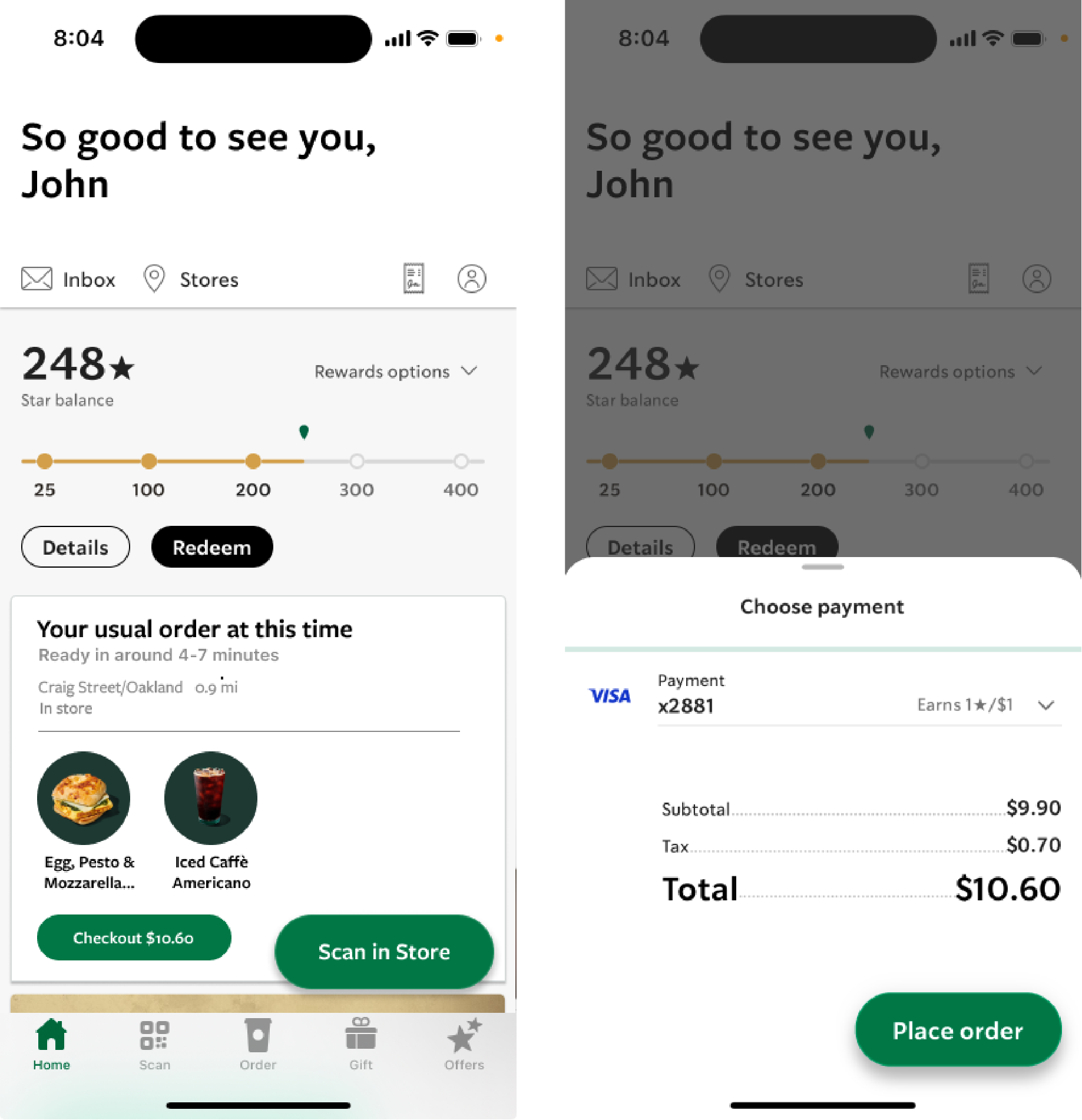
Reduced total screens by merging review and checkout stages.
Surfaced all order details (items, pickup store, and payment info) directly in the home banner.
Added an instant “Checkout” button for one-tap confirmation.
05 Final Prototype
The Predictive Pre-Order Experience
Feel free to interact!
06 Reflection
Designing the Invisible


As design lead, I learned that small frictions compound into big frustrations, and solving them quietly can create outsized value.
Pivoting from “many/most users” to “consistent commuters” grounded our design in real behavior. Our emphasis on restraint (predicting only where patterns were clear) ultimately preserved user agency.
As for AUIs specifically, I realized that they are not only powerful tools for streamlining repetitive tasks and driving significant impact but can also be subtle enhancements that create small yet meaningful improvements, which, over time, can contribute to larger transformations.
Key Takeaway:
The best adaptive systems don’t show off their intelligence. They simply make everyday routines feel effortless.