LeanFM Technologies
Dashboard Redesign
UX/UI Design Internship • 3 min read
LeanFM Technologies is a cloud-based AI software that finds root causes and insights relating to HVAC faults.
Overview
My Experience
During this internship, I collaborated directly with the CEO and CTO to redesign the LeanFM Prescriptiv dashboard (a predictive HVAC analysis tool used by enterprise clients).
My work focused on improving clarity, usability and efficiency in how facility managers visualize energy, performance and predictive maintenance data.
UX/ UI Design Intern
My Role
Figma, Adobe CC, Git, JS/HTML/CSS
Tools
8 weeks
Duration
Summer 2023
Remote
Location
Table of Contents
01 Current Analysis
From Clutter to Clarity
Research + Brainstorm
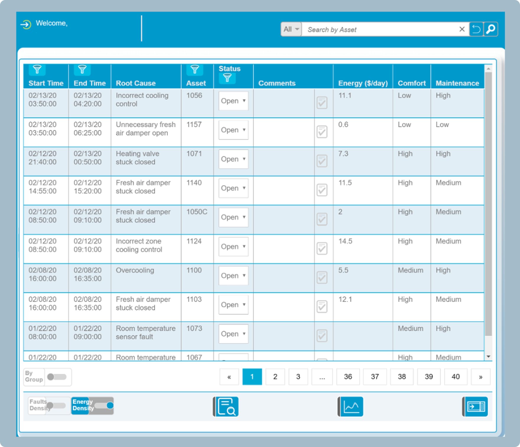
I began by analyzing the existing dashboard.
Our goal was to understand where visuals, navigation, and data presentation created friction.
Key Observations
The previous UI lacks visual hierarchy
Navigation is broad, but the tasks are specific (users have to dig through large data sets for root-fault detection)
Color palette and typography does not support quick readability in high-pressure maintenance settings
02 Synthesis
Defining Clarity
Strategy
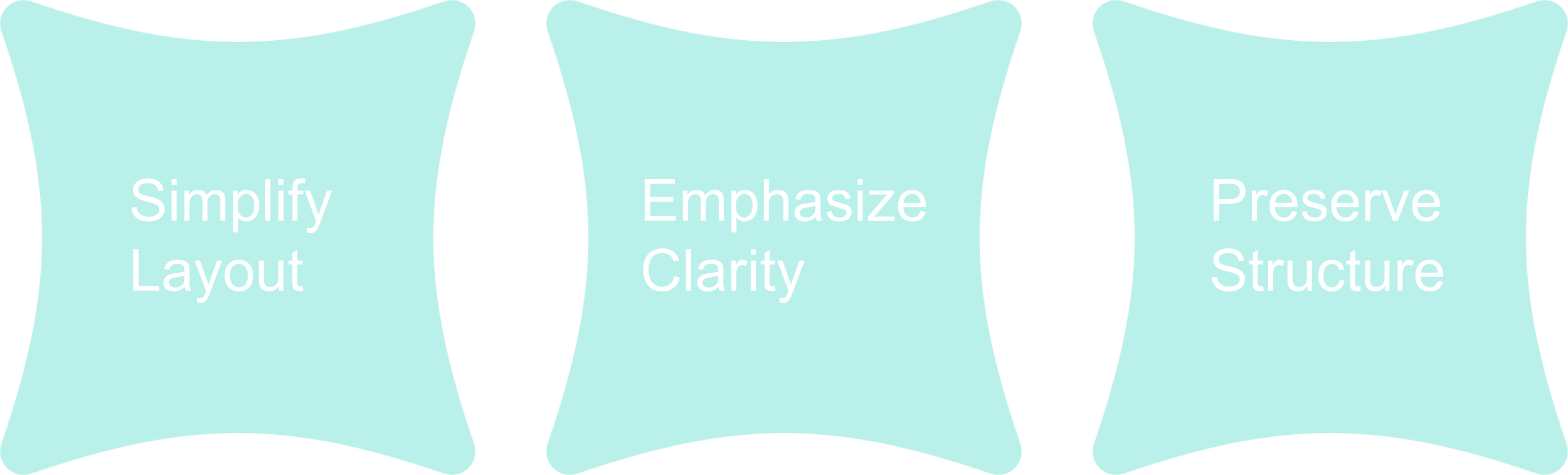
Based on the analysis, I defined the redesign strategy: simplify layout + emphasize clarity + preserve structure for seamless implementation
I created a key user story to keep in mind: “Facility manager reviewing root-cause analysis on a tight schedule” and prioritized task flows accordingly
Goal
Deliver a dashboard that is both visually accessible and technically implementable.
03 Design
Iterating to Efficiency
Iteration 1
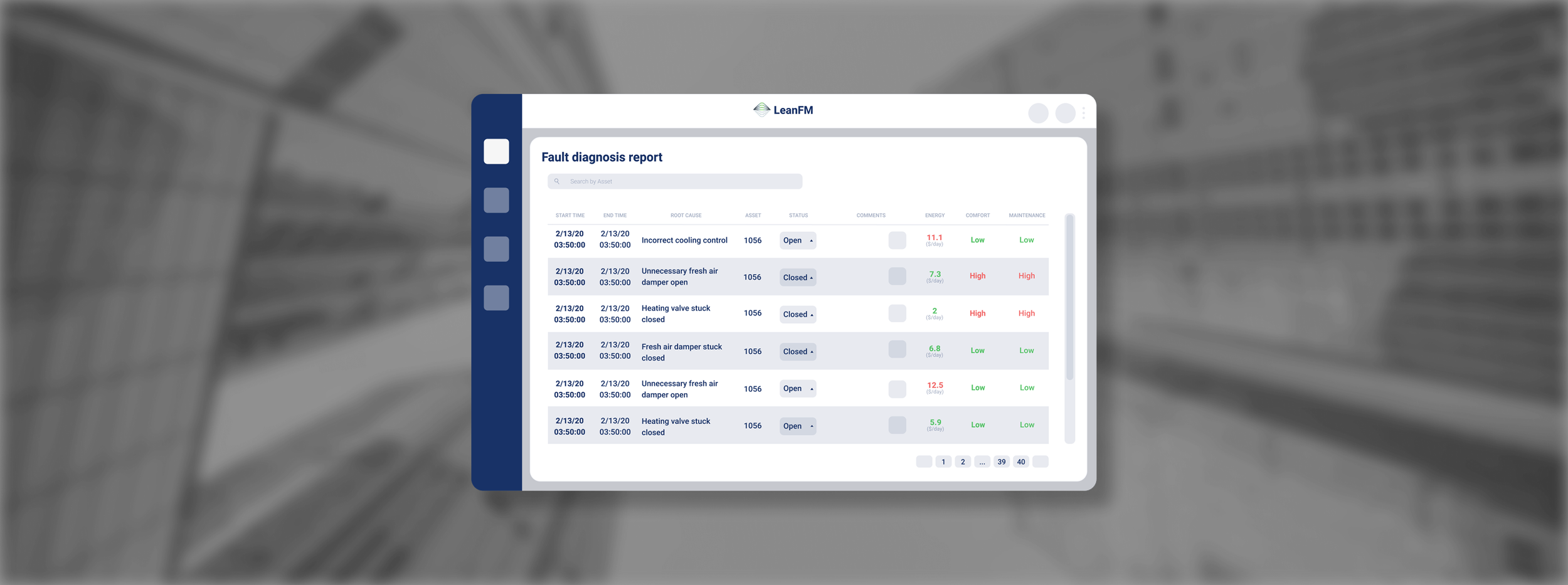
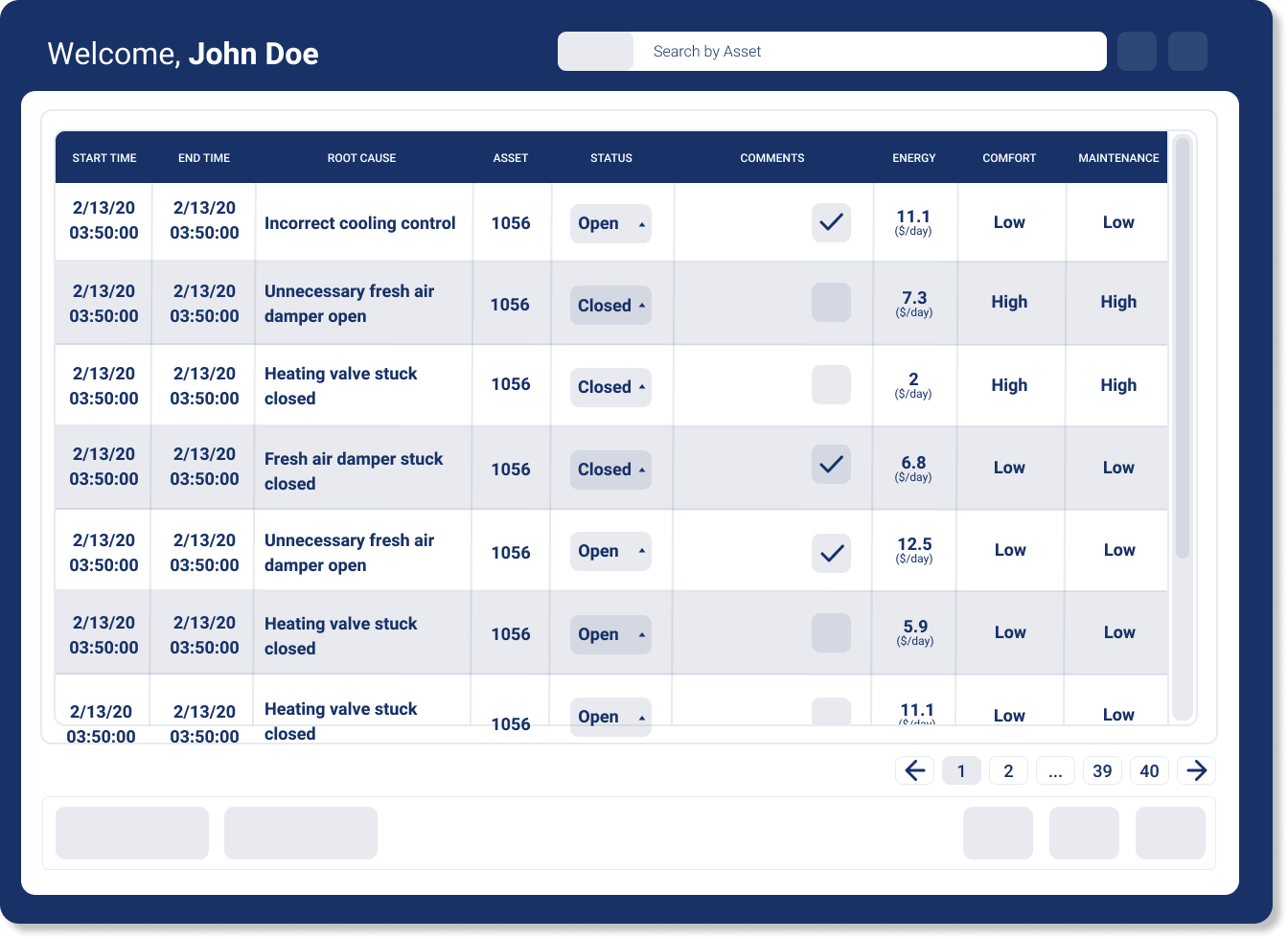
The first redesign focused on visual clarity and accessibility while maintaining the existing structure
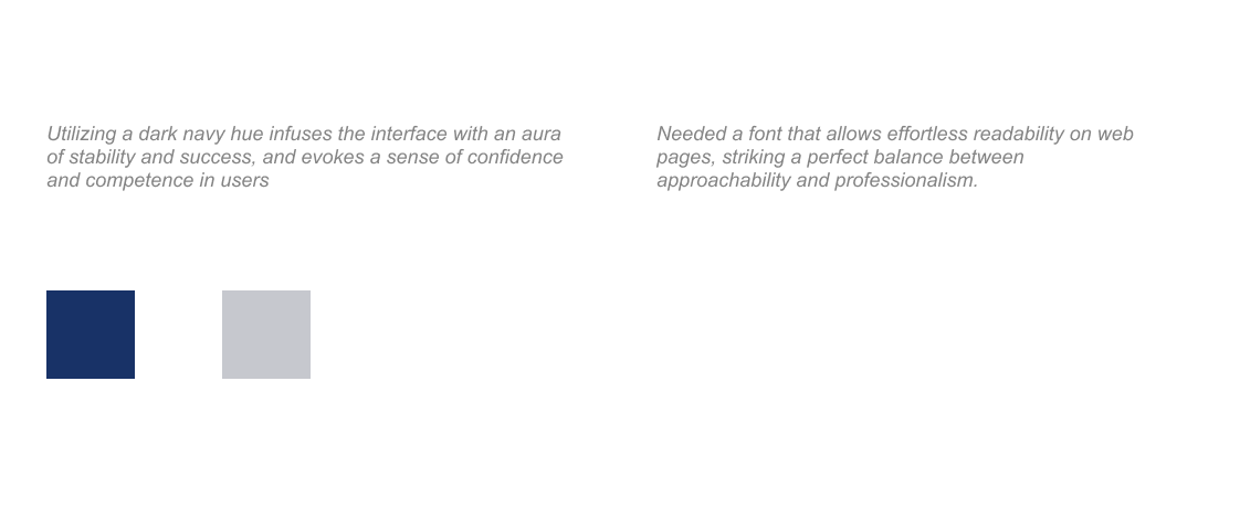
I also introduced a new typeface and color palette (Heebo font and a darker navy color)
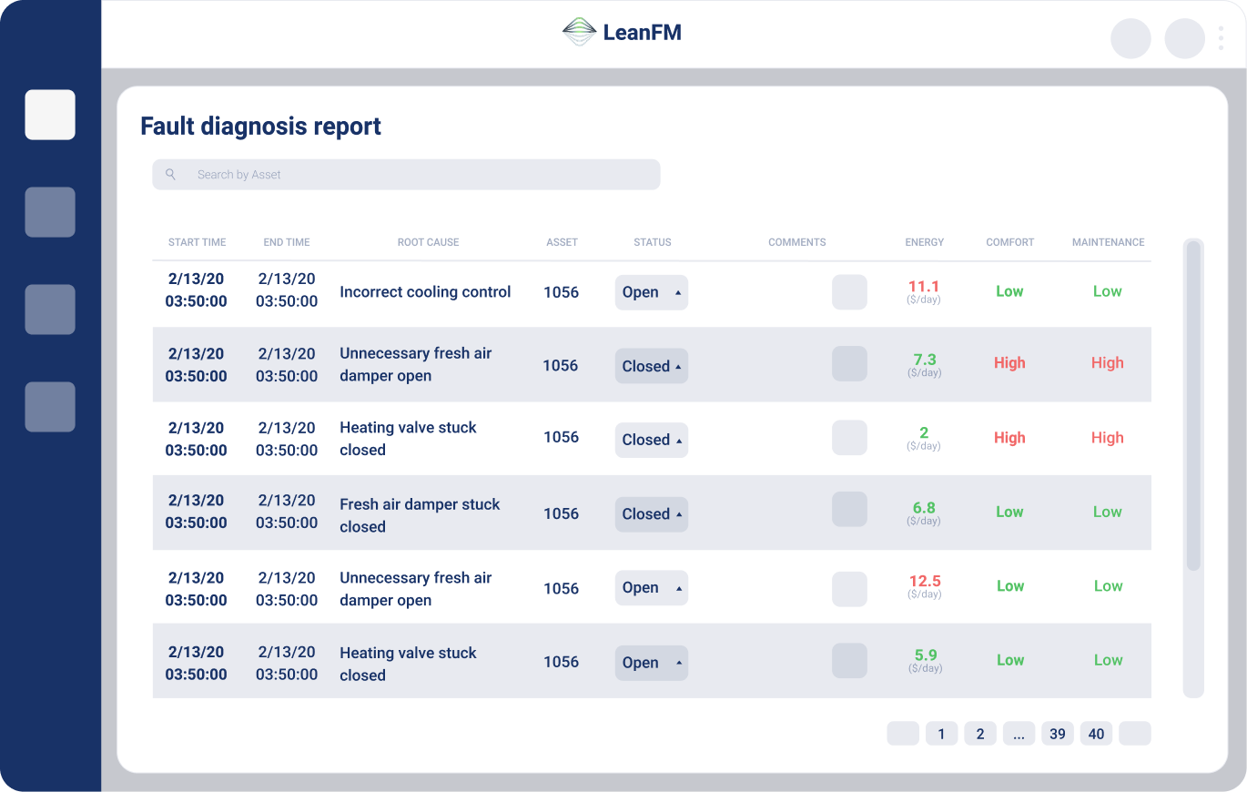
Iteration 2
This second redesign also focused on visual appeal and accessibility, but I changed the overall structure in case the company chose to make large-scale technical changes
I stayed consistent with my usage of the Heebo font and darker navy as the primary color
I also relocated the navigation bar to a left panel and introduced red/green indicators for fault levels to better the urgency cues
04 Final Design
Overview of Design Decisions

Result
A dashboard that guides users through information rather than overwhelming them with it.
Initial UI
Dense layout with competing data points
Flat color palette with poor urgency signaling
Ambiguous typography and spacing
Difficult navigation for frequent tasks
Final Prototype

Streamlined sections and clear modular grouping for fault categories
Enhanced contrast and color-coded severity levels (red for critical, green for resolved)
Implemented consistent font hierarchy (Heebo) and improved line spacing for scannability
Added side navigation and logical task flow to reduce clicks and cognitive strain
05 Handoff
Design to Development
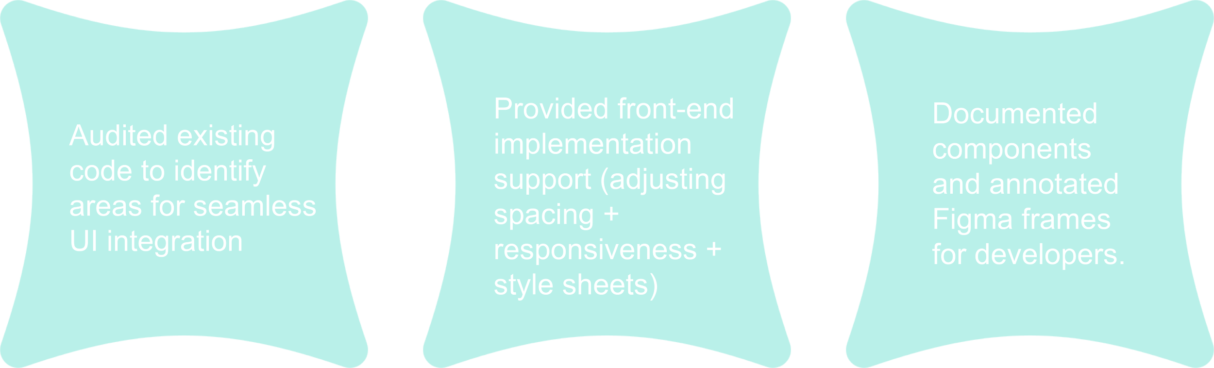
Implementation
Once the design system and final mockups were approved, I collaborated directly with the CTO to translate the new UI into development
06 Reflection
Translating Data to Design

This experience taught me that clarity in complex systems is more than just a design principle, and is also a service to the user.
I learned to communicate across disciplines and balance visual innovation with engineering constraints. I also am grateful for the opportunity to see front-end collaboration as a continuation of design, when previously I would have considered it more of as an afterthought.
A Big Thank You to CTO Xuesong (Pine) Liu for the opportunity. Your guidance and support, especially as an alumni of my current university, have been invaluable in shaping my skills and understanding of the industry.