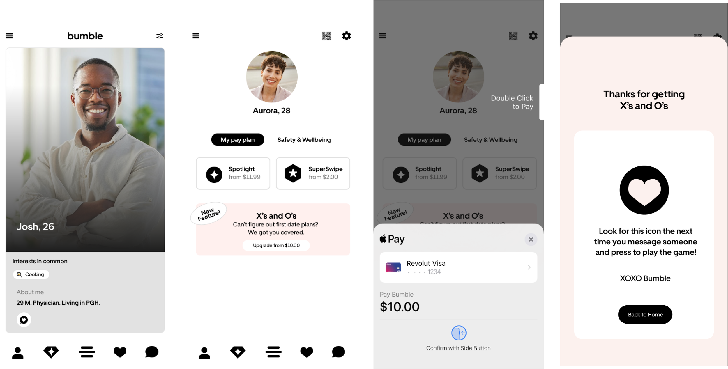
X’s and O’s
Turn Matches Into First Dates
case study • 7 min read
An interactive, in-chat game that uses geolocation data to help two people choose a first-date plan.
The Problem
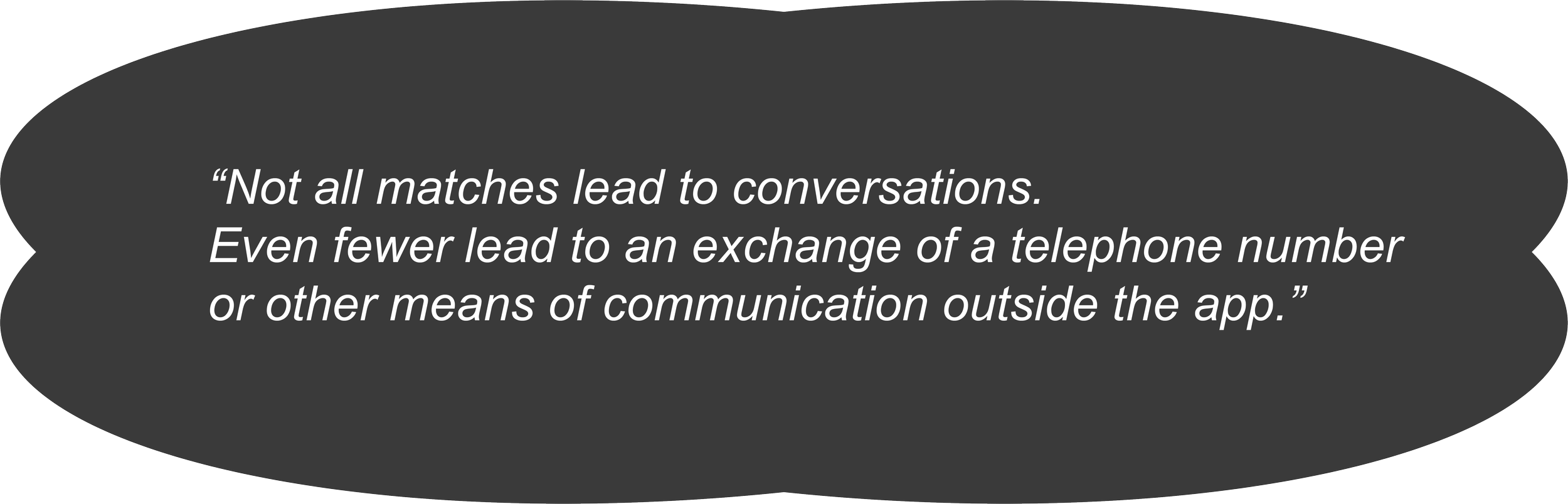
Matches Don’t Always Become Dates
Moving from “we matched” to “where/when should we go?” is awkward and effortful. The opportunity: reduce planning friction inside the chat so momentum isn’t lost.
I wondered: How might we turn conversation energy into a concrete plan…without leaving the thread?
Research + Opportunity, Problem Definition,
Process
Ideation, Prototyping + Interaction, Usability Testing
UX/ UI Designer + Researcher
My Role
Figma
Tools
4 weeks
Duration
Feb-Mar 2024
The Solution
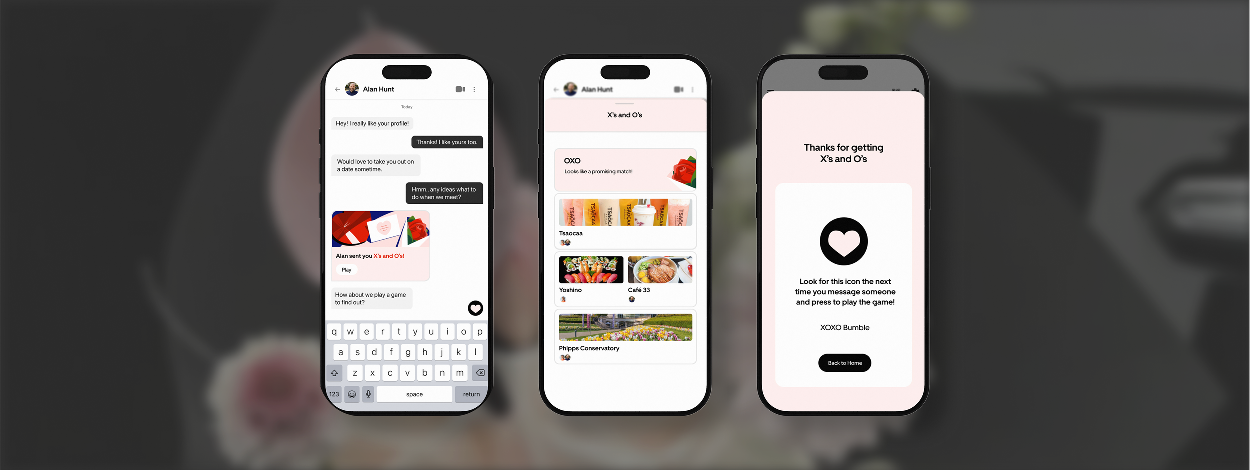
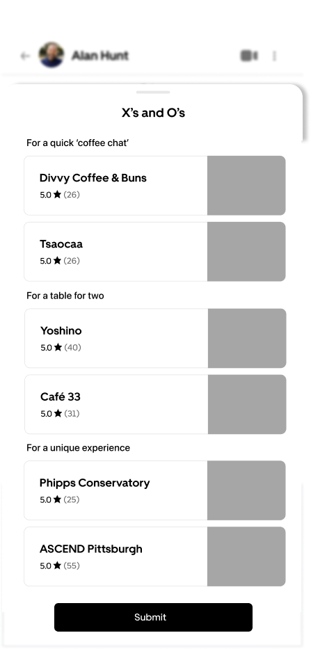
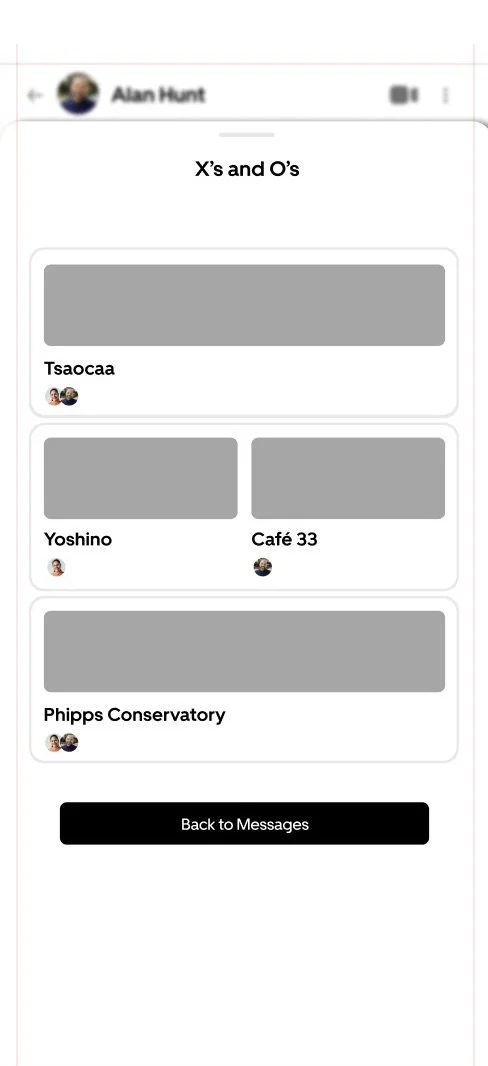
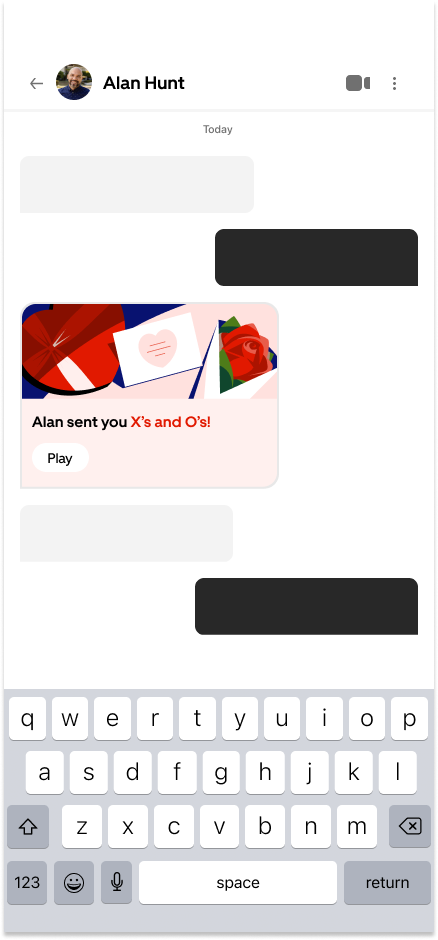
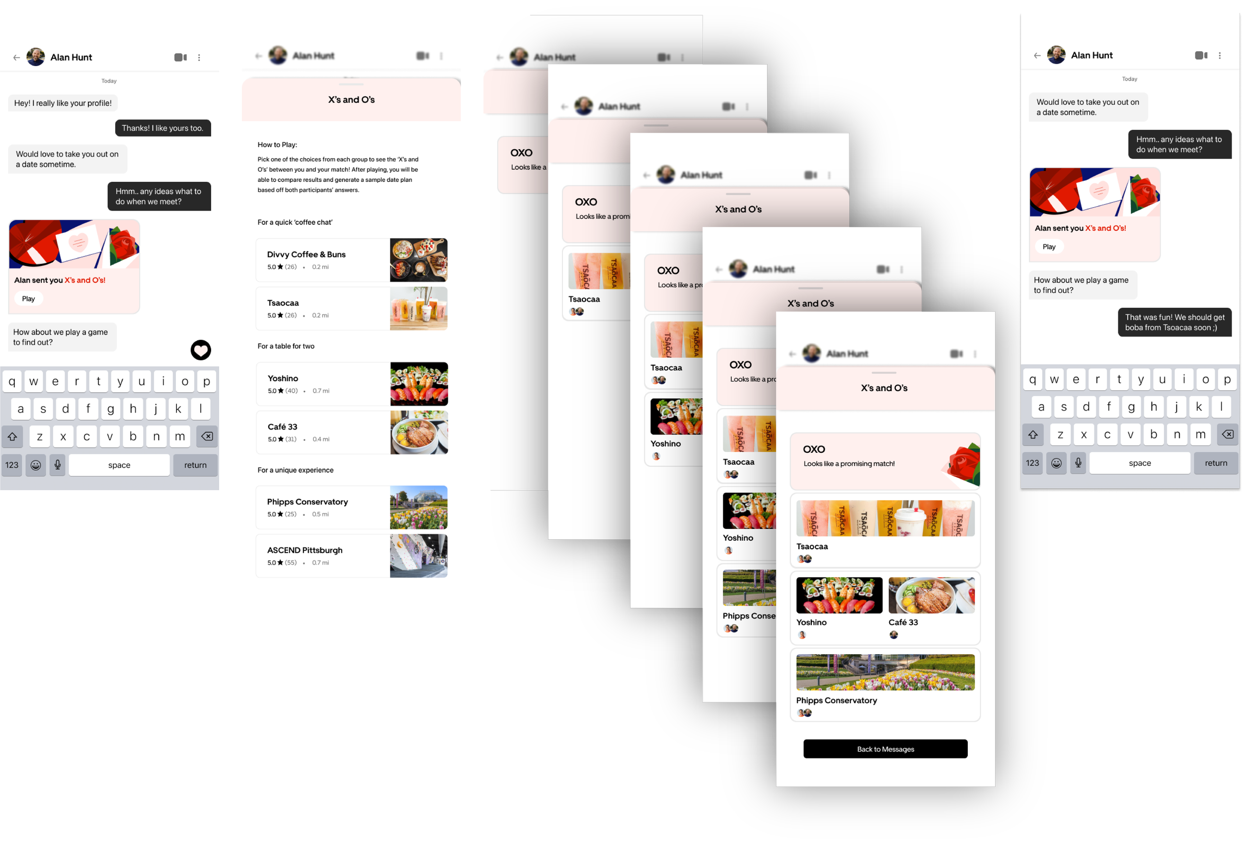
X’s and O’s (The First Date Picker)
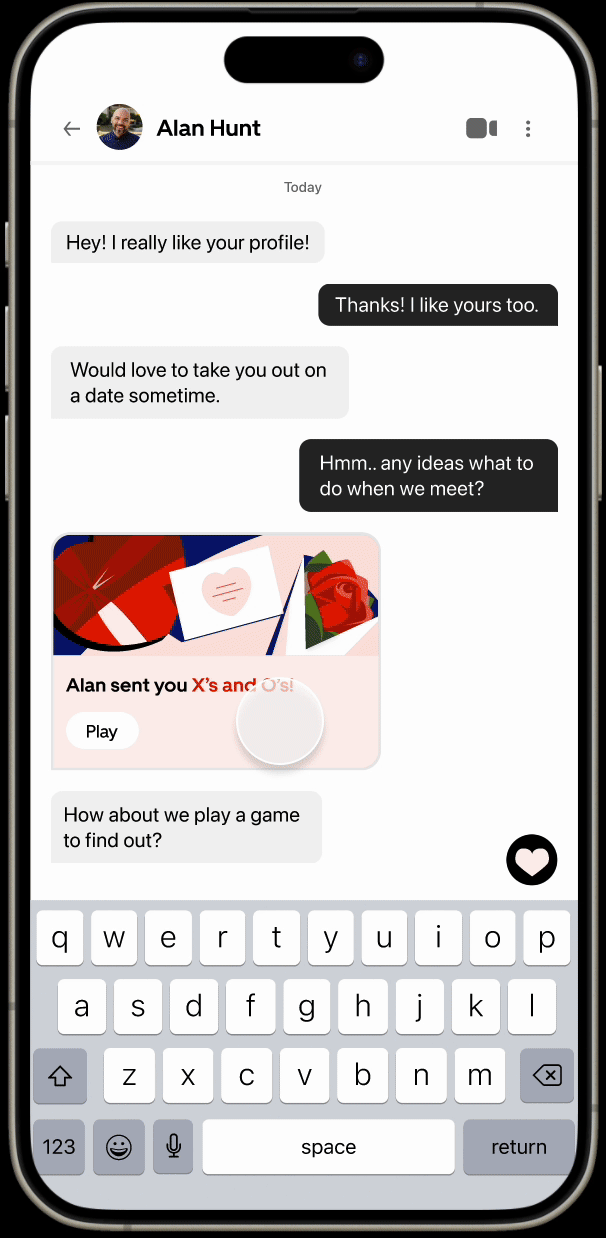
A lightweight, tap-to-choose mini-game embedded in Bumble chat.
Gamifying a Pain Point
A lightweight, tap-to-choose mini-game embedded in Bumble chat where each person picks food + activity suggestions
results reveal your O’s (matches) and X’s (no-match), then propose a spot you both like.
Designed to be fun, low-pressure, and decision-forward.
Table of Contents
01 Research
Understanding Why Matches Don’t Become Dates
Defining the Problem
Across dating apps, the drop-off between “matching” and “meeting” is steep. I hypothesized that one of the main reasons is friction in planning (users struggle to suggest activities, agree on places, or keep the conversation alive long enough to meet).
If Bumble could keep date planning inside the chat, it could convert more matches into actual meetups.
Qualitative Observations
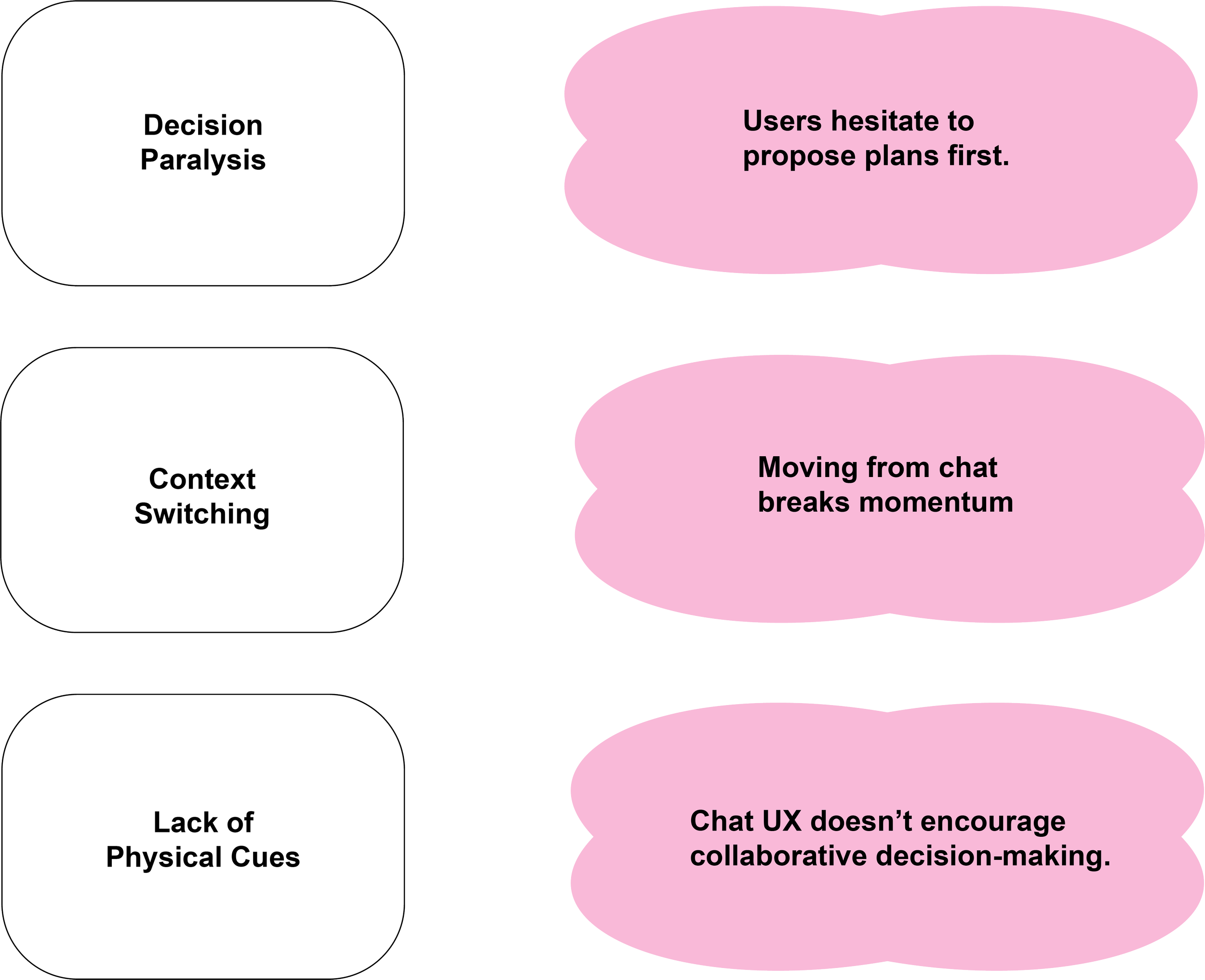
I observed three peers using Bumble and similar dating apps over several days. Each participant had active matches but expressed frustration when trying to move conversations toward actual plans.
Through these informal think-aloud sessions, I noticed recurring behavioral patterns when trying to make plans that revealed where momentum breaks down.
02 Synthesis
Defining the Problem
To humanize my research, I developed a persona.
Goals During Ideation
Through this persona, I came up with a list of goals to keep in mind during the ideating phase.
Problem Statement
Alex, 27, an active Bumble user
Matches frequently but rarely meets up.
Finds it awkward to suggest plans too soon.
Prefers low-pressure, interactive icebreakers.
How might we reduce planning friction between matches by introducing a lightweight, in-chat experience that helps them pick a date together?
03 Ideation
From Icebreaker to Planner
What Kind of Experience?
I explored two concept directions for the in-chat experience:
Why the Game Option?
Date-Card Deck
Swipe left or right (similar UI to Tinder) for potential date ideas, compare results after
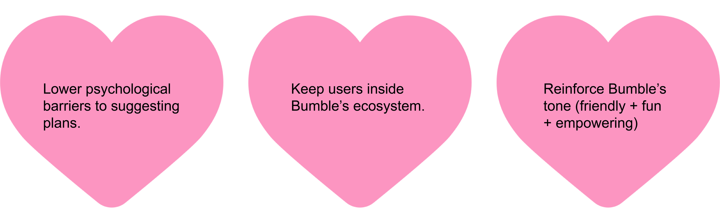
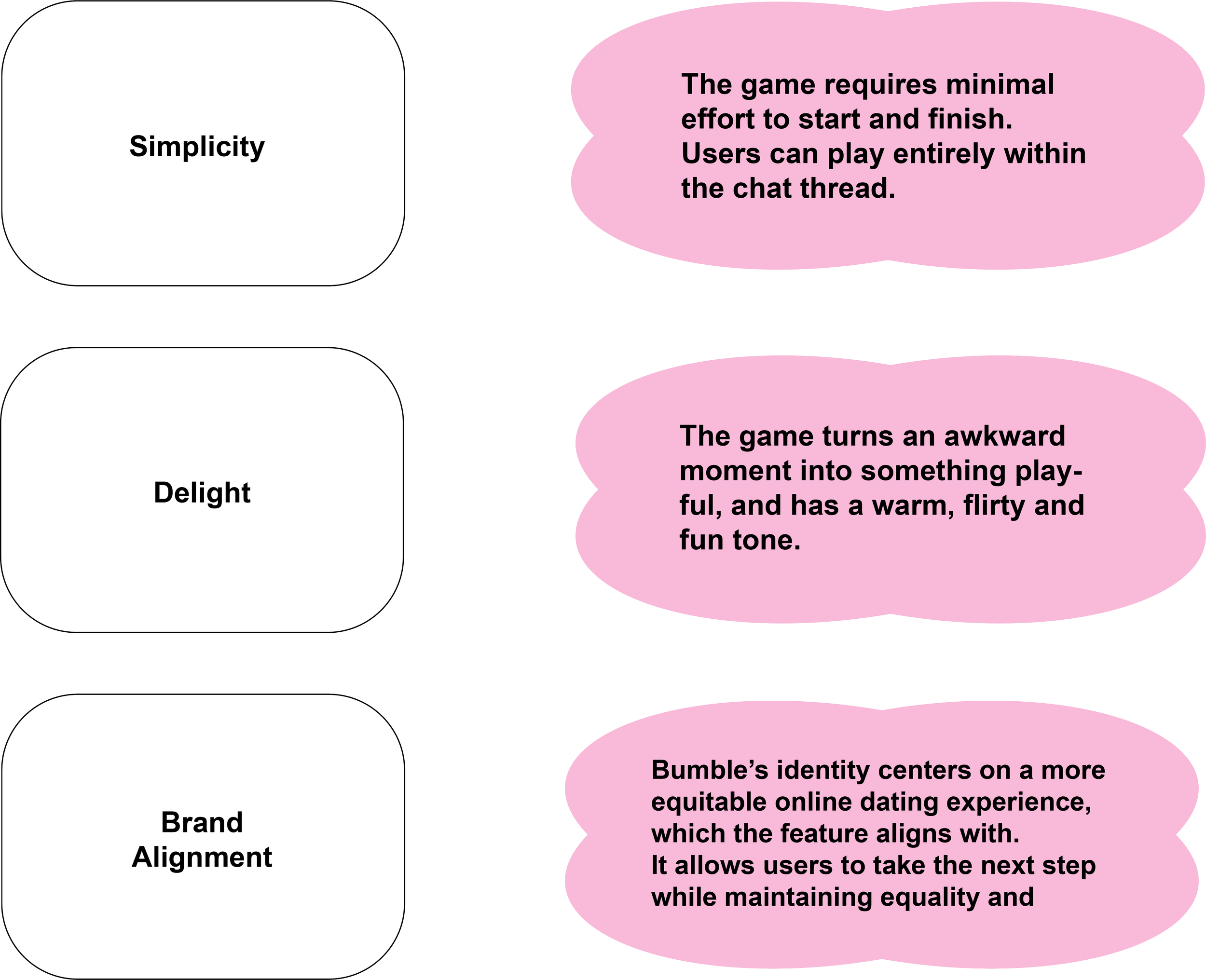
I decided to go with the ‘Play to Plan’ Game Option.
This concept struck the right balance between simplicity, delight, and brand alignment.
It addresses the behavioral gap by turning planning into a shared activity rather than a task. It allows both parties to participate equally, which ultimately creates connection through collaboration rather than decision fatigue.
It is also important to note that the Date-Card Deck is similar to Tinder’s swipeable UI (which is Bumble’s competition).
‘Play to Plan’ Game
A mini-game that turns overlapping choices as a match
04 Design
Making Planning Feel Like Play
Design Principles
Interaction Flow
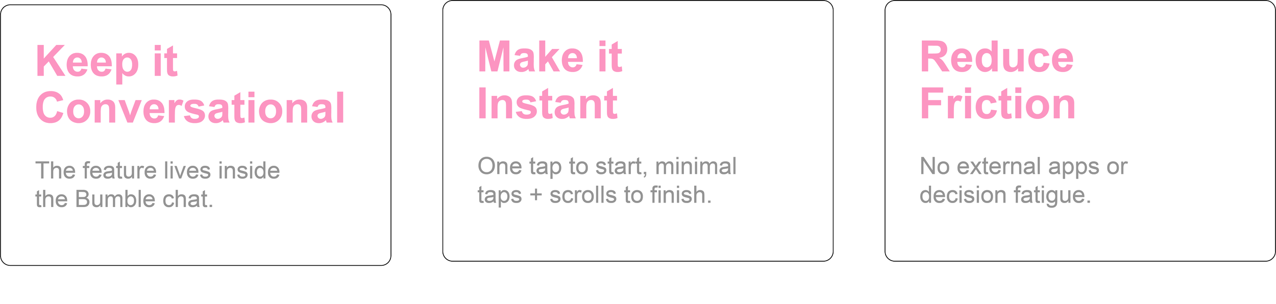

Goal
Make gameplay feel like a natural extension of the messaging experience
Mid-Fi Design
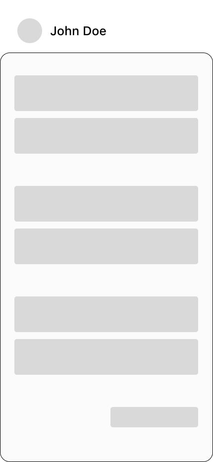
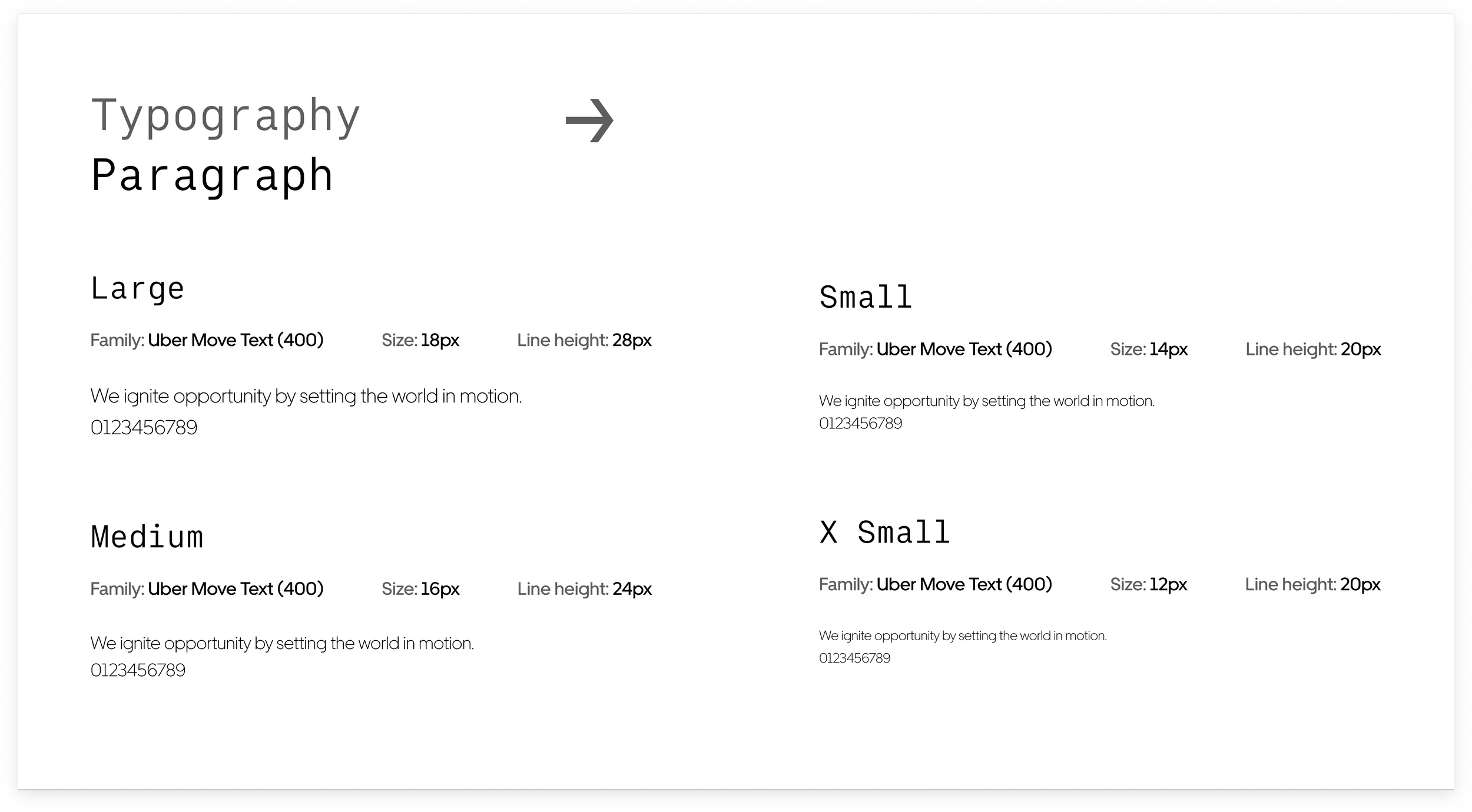
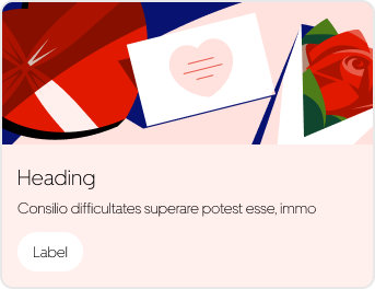
In this stage, I focused on visual consistency. I implemented Uber’s Base Design System for its clean + modular structure.
The Base components brought clarity to card spacing, typography hierarchy, and button placement.
Goal
Base Design System Elements
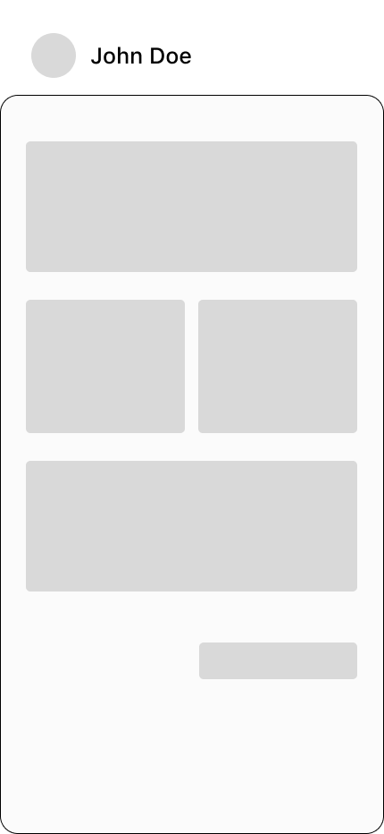
Lo-Fi Design
I began with low-fidelity wireframes exploring how users could launch and play the game without leaving the chat.
I was inspired by Apple’s GamePigeon interface. I introduced a swipe-up game card that slides from the bottom of the screen, which allows players to engage and return to the conversation instantly.
This layout made the experience feel organic to the chat and prevented users’ interactions to be disrupted.
Introduce visual order while preserving Bumble’s interface.
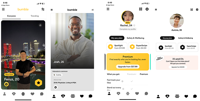
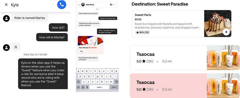
Uber/UberEats UI inspiration
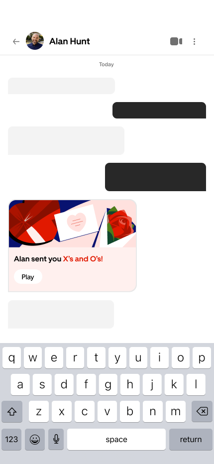
Hi-Fi Design
In the final high-fidelity prototype, I expanded on the Uber Base foundation by pulling references from Uber Eats’ UI. These additions enhanced visual depth and hierarchy.
Hi-Fi Design Cont.
To maintain Bumble’s brand familiarity, I preserved its tone and visual warmth to make the feature feel native to the app. The result was a cohesive experience that balanced clarity, emotion, and play.
Bumble UI inspiration
05 Final Prototype
From Chat to Date in One Flow


06 Reflection
Designing for Connection


Throughout this solo project, I learned that removing friction is just as important as adding features for a meaningful user experience. A small moment of hesitation can kill the spark.
Pivoting from static prompts to an interactive game turned planning into play, which made it easier for users to move from chatting to meeting. I also realized the importance of both trust and delight in social design. Users won’t engage as deeply unless the experience feels natural and human.